| back to index | |||
H2 Attraction Space * |
|||
 Sample start button design. |
|||
| ... you are designing the interactive appearance of an interactive
exhibit - Attract-Engage-Deliver. You are
currently looking at the first step, and need to find out what
the system should look like when it is first encountered by
the user, and how it can fit into its environment.
|
|||
|
* * *
|
|||
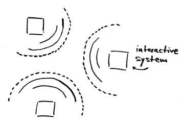
| In an environment such as an exhibition centre, many systems
are competing for the visitor's attention. To find out about a
system's message, visitors first have to notice it. However, if a
system is too visually active or noisy in its appearance, it can
disturb the atmosphere of its entire environment.
|
|||
| Idle state | When an interactive system is not being used, its appearance in the "idle" state is the first thing that a passing visitor notices. If this impression does not draw the visitor towards the exhibit, he will never find out about what the system has to offer. After all, there is usually nothing that forces a visitor to use any of the stations in an exhibition centre. This is very different from the situation in which, for example, office software is used: there, users need to get a job done, and have their own initial motivation to approach and explore the system. | ||
| Visual and auditory channels | There are two principal channels that an exhibit can use to increase its noticeability: visual signals, which are directed and therefore only noticed if the visitor looks into that direction, and auditory signals, which are undirected and therefore much stronger, since they are noticed by everybody in the vicinity. Strong visual cues such as intensive animation or very large displays can also have an undirected effect, since they draw attention even when they are observed in the visual periphery of the user. However, a system must not create too much audible noise or visual disturbance, because a sensory "overflow" will irritate users and make them leave the entire environment to escape from such a multimedia chaos. Instead, the systems within such an environment need to coexist to create a positive overall experience for the visitor. |
||
| WorldBeat: Visual attraction |
The WorldBeat exhibit solves this conflict in the following way. Although it is an exhibit about music, it does not create any noise when not in use. Instead, it shows a very simple, and aesthetically pleasing, opening screen that invites the visitor to explore the exhibit. No animation is used, and the impression is quite calm. But its main attraction is created by a different visual cue: a pair of infrared batons is dangling from the ceiling in front of the screen. There is a little light blinking on each baton, barely visible, but just enough to show that the batons are "alive". These batons look interesting, they are something the user has never seen before, and therefore invite exploration. Despite this attractive appearance, the exhibit does not dominate the space around it further than its distance to the next exhibit allows, neither by auditory nor visual means. | ||
| Start button |
Another example is a typical start screen of a video game or kiosk system. These screens often use a specially rendered, three-dimensional, or textured "Start" button (see the opening picture) that the user has to press to enter the system. This button looksmuchmore inviting than the simple word "Start" on a screen, but it also only dominates the space belonging to the display of this particular system. Naturally, the right level of sensory stimulation depends on the application domain. A video games arcade hall is a good example of this point. It often creates a noisy environment with flashing light effects, where the stimuli from neighbouring systems strongly interfere. While this is the environment many players seem to like; it is obvious that it would be far too overloaded to be adequate for studying exhibits in an exposition centre. | ||
| Fin-Fin |
In 1998, the Techniek Museum Delft created an exhibition called "De Digitale Schoolreis" (The Digital Class Excursion), which included, among other exhibits, a dolphin "Fin-Fin" (an interactive computer character) that children could interact with. The fact, however, that this dolphin started whistling every few minutes to attract attention to itself soon drove the museum staff crazy; it penetrated the attraction space of an entire floor. This shows that especially audio stimuli can easily become a nuisance, not only in office software, but also in interactive exhibits. |
||
|
Therefore: Define an attraction space around your system that is as large as possible, but without penetrating the attraction spaces of neighbouring exhibits. Then, make sure that your system does not frequently violate this border. To achieve this, use primarily static visual stimuli in the physical shape and appearance of your interface that look attractive by their design alone. Avoid excessive animation, and especially frequent undirected stimuli such as audio, because they easily interfere with neighbouring attraction spaces. |
|||
 |
|||
|
* * *
|
|||
|
A good way to attract people is to make your system look
like something they have never seen before - Innovative Appearance. However, you should make sure that
your system does not scare off potential users because it
looks too complicated to use - Simple Impression.
You can convey a quick first idea of what your system is
about by using periphery that matches your application
area - Domain-Appropriate Devices....
|
|||
This pattern is taken from the book "A Pattern Approach to Interaction Design" (PAID) by Jan Borchers (John Wiley and Sons, Chichester, UK, 2001). Copyright 2001 John Wiley and Sons. Used by permission. See http://media.informatik.rwth-aachen.de/paid.html for more information. Online version by Susan Babutzka, ETH Zurich (subabutz@student.ethz.ch). |
|||